How to create relational databases in Excel 2013

 Image: PC World
Excel used to be the poor schmuck’s database, with spreadsheets that just sort of sat there. You could create something more sophisticated with LOOKUP functions, but they were a huge hassle to set up.
Not anymore: Excel 2013’s table tools include features that make it easy to link charts and cells, perform searches, and create dynamically updated reports, just like—yes—a relational database. Excel can handle a lot of day-to-day office data this way, and we’ll show you how to set it up.
How Excel makes a relational database
Relational databases—databases structured to recognize relations among the information stored in them—are essential for working with large amounts of business data. They let you quickly search and retrieve specific information, view the same data set in multiple ways, and reduce data errors and redundancy. Try doing that with a spreadsheet.
To show you how Excel makes it easier, we will create two tables: the master table and the detail table. The master table is the primary table, which generally contains unique records (such as name, address, city, state, etc.). This table rarely changes except to, say, add or delete individuals.
For every record in the master table, there can be many records in the detail tables (also called slave or child tables) that link back to the master table. This is called a one-to-many relationship. The data in the detail tables—such as daily sales, product prices, quantities—usually changes constantly.
To avoid repeating all the master information in every detail table, you create relationships using one unique field, such as the Sales ID, then let Excel do the rest. For example, you have 10 sales people who all have unique, demographic information (master table). Each sales person has 200 products that he/she sells (detail or child table). At the end of each year, you need a report that provides the total yearly sales by person, but you also need a report that provides the total sales by city.
For this tutorial, we’ll create a master table with the salespersons’ information and a second table that provides their total sales, by quarter, for the year. The Sales ID is the relational field that connects the tables. Then, we’ll create a report (or pivot table) that shows which cities had the highest sales.
Open Excel and select a new, blank worksheet.
Create the master table
1. First, double-click the tab at the bottom of the screen (above the green bar line) and type Master over the tag line Sheet1.
2. In cell A1 type: Master. In cells A3 through F3 type these column headers: Sales ID, Sales Person, Address, City, State, Zip Code.
3. In cells A4 through A13 type the sales ID numbers—in this case, 101 through 110. The Sales ID is the unique data value that’s used to create a relationship between your two tables.
4. Enter names, addresses, cities, states, and zip codes in the remaining cells. You can copy the information from this sample worksheet or create your own data. Since we are looking for the highest sales by city, be sure to create multiple cities in your table. For example, we have three salespeople in Los Angeles, two in Hollywood, two in San Francisco, and three in San Diego.
5. Once the data is entered, highlight A3 through F13, including the column headers. From the Styles group, select Format as Table. From the dropdown, choose a color and format you like. A Format As Table dialog box appears with the table range displayed in the white box. Ensure that the My Table Has Headers box is checked, then click OK.
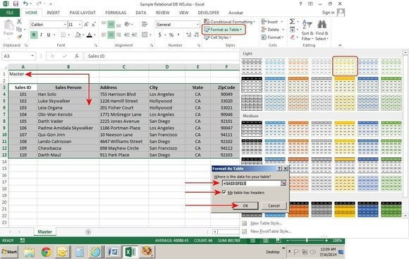
Create the master table.
6. With the table still highlighted, select the Design tab under the text that says Table Tools (this option is available only when the table is highlighted). In the Properties group (far left), in the box under Table Name, type Master.
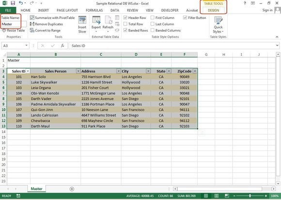
Highlight and name the table.
Create the detail table
1. At the bottom of the screen beside the Master tab, click the ‘+’ sign to insert a new sheet. Double-click the tab and type Sales over the tag line Sheet2.
2. In cell A1, type Total Sales for 2013. In cells A3 through E3, type Sales ID, Quarter1, Quarter2, Quarter3, and Quarter4.
3. In cells A4 through A13 type the sales ID numbers: 101 through 110.
4. In B4 through E13, enter 40 random numbers that represent sales dollars or copy the data from this example table.
5. Once the data is entered, highlight cells A3 through E13. From the Styles group, select Format as Table. From the dropdown, choose a color and format you like. A Format As Table dialog box appears with the table range displayed in the white box. Ensure that the My Table Has Headers box is checked, then click OK.
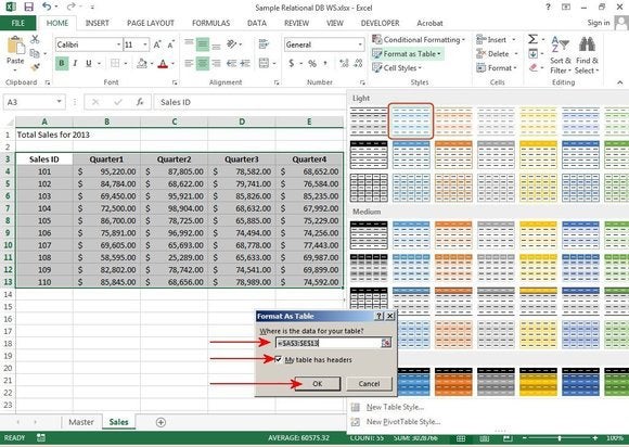
Create the detail (Sales) table.
6. With the table still highlighted, select the Design tab under the text that says Table Tools (this option is only available when the table is highlighted). In the Properties group, in the box under Table Name, type Sales.
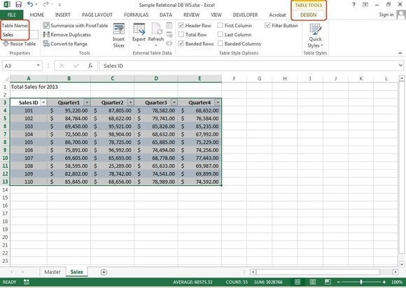
Highlight and name the detail (Sales) table.
Set relationships in the pivot table report section
The first rule of pivot tables: You must define the table relationships within the Pivot Table report section. Do not attempt to create the relational connections first, because Excel will not recognize them from the Pivot Table reporting section. Also, be sure to select the detail table (Sales) for the “analyze data” table, otherwise it won’t work.
1. Go to the Sales table and highlight cells A1 through E11. Click the Insert tab, then click the Pivot Table button.
2. In the Create Pivot Table dialog box, ensure that the Select a Table or Range > Table Range field says “Sales.” If you want to import a table/database from another program such as Word or Access, click the second option, Use an External Data Source.
3. In the second field—Choose Where You Want the Pivot Report placed—click New Worksheet if you want the table on a separate sheet by itself, or click Existing Worksheet if you want the report to drop in beside your Sales table.
4. And for the last field—Choose Whether You Want to Analyze Multiple Tables—click Add this Data to the Data Model, then click OK.
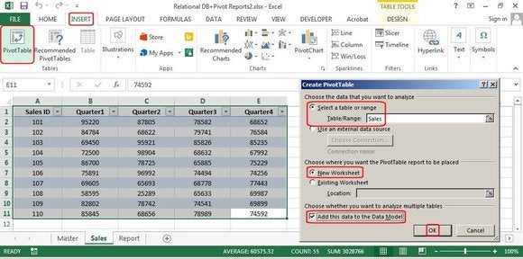
Insert and create the Pivot Table.
The Pivot Table menus appear with a Help box on the left that says “To build a report, choose fields from the Pivot Table field list.”
1. Under Pivot Table Fields, the Active button is selected because only one table is currently active. Click the boxes Quarter1, Quarter2, Quarter3, and Quarter4 and some numbers appear in a grid on the left.
2. Click the All button, then click the Master table link. The fields from the Master table appear. Click the box beside City. A yellow box appears that says “Relationships between tables may be needed.”
3. This is where you define the relationship between the two tables. Click the Create button and the Create Relationship dialog box appears. Under Table, click the down arrow and choose Sales from the available tables list. Under Column (Foreign), click the arrow and choose Sales ID from the field list.
4. Remember the Sales ID is the only field that’s in both tables. Under Related Table, choose Master and under Related Column (Primary), choose Sales ID again, then click OK.
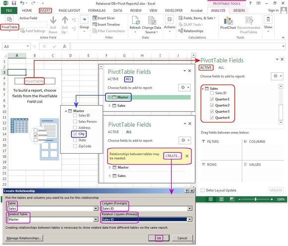
Select fields from sales and master tables, then create relationship.
Excel makes the connection, then displays the report on the screen: Total Sales by City. Enter a report title in A1, and it’s complete.
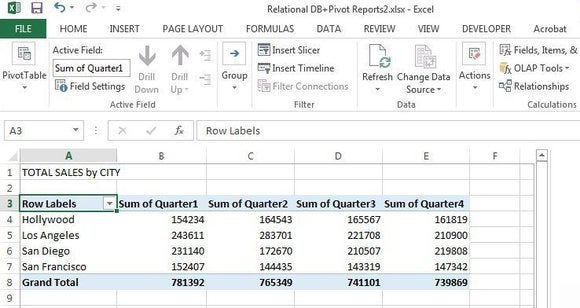
Total sales by city report.
Sort, create filters, and select data by other fields
Filters are used to select specific data by fields. To filter the data by city, click anywhere inside the table, then click the city field—notice the small arrow on the right.
1. Click the arrow and the Sort-Filter Options dialog box pops up with selections for Filters and Sorting. If you want to Sort, click Sort A to Z or Sort Z to A, or see the graphic below for the options under Sort More Options.
The Filter options include Label Filters, Value Filters, and Search (or select specified records in the current search field). If you have a huge database with hundreds of records, you can enter a city name (or partial name) in the Search box, then click the hour glass to locate the specified record/city. Excel displays the city in the list below the Search box.
2. If your database is relatively small, first uncheck the Select All button, then scroll down to the city you want, click the box, then click OK. The report now shows total sales for each quarter in that city only.
Label Filters and Value Filters are additional filtering options to help you refine your search. For example, in the Label Filters, if you choose all cities that Begin With “S,” you get San Diego and San Francisco. If you choose all cities Less Than “S,” you get Hollywood and Los Angeles. Numeric fields are filtered the same way most all other databases do it—Less Than, Greater Than, Equals, Between, etc.
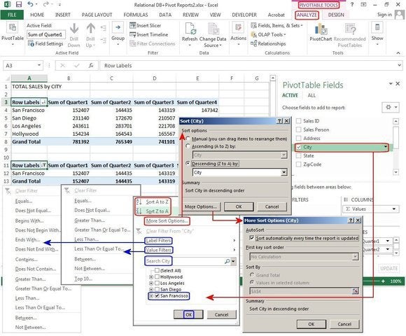
Sort and filter by City for custom results.
3. You can also select a different field and quickly create a new report. For example, if you’d like to see the quarterly sales plus totals by sales person, uncheck City and check Sales Person. The report drops in.
4. Next, click Sales Person, click the down arrow, then uncheck Select All in the Sort-Filter Options dialog box. Click four names on the list, click OK, and the filtered report drops in.
The Pivot Tables/database options are endless. There are numerous ways to analyze the data, create and manage sets, group fields, insert slicers and timelines, drill up and down, and import and export data, as well as design reports with custom layouts and styles, create hundreds of colorful charts, then print it all out for distribution.
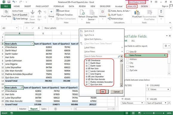
Total sales by sales person, then filter by selected sales persons.
Charts and styles
To spice up your table before you print it, try adding a chart and/or some colors and style to the table.
To add a chart, highlight the table, select Pivot Table Tools > Analyze > Tools > Pivot Chart, then select a chart from the gallery of charts, and click OK.
To add colors and style, select Pivot Table Tools > Design > Pivot Table Styles and choose a table design from the gallery of styles. Click Banded Rows under the Pivot Table Style Options group to alternate colors and/or shading on the odd and even rows for easier viewing. And that’s all there is to it.
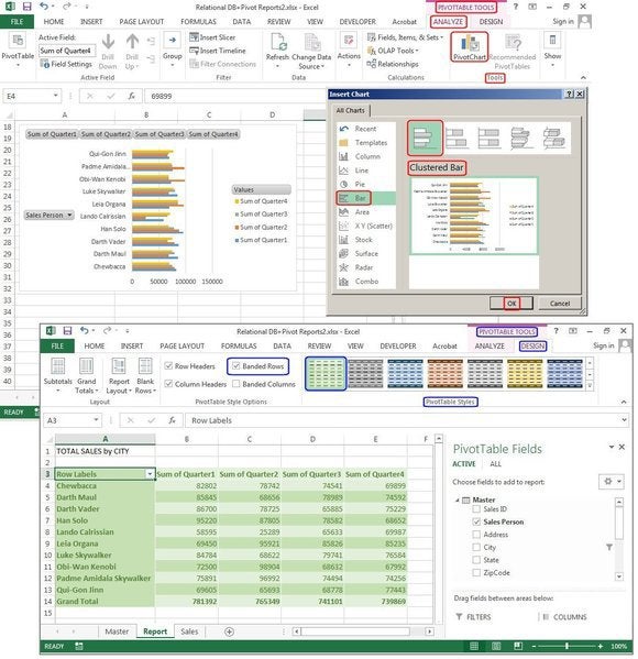
Add flair with charts and styles.
With this new relational database/table feature, this process is so easy that once it’s set up in Excel, you can extract specific data and create dozens of reports in minutes.


