What to do with Excel 2016's new chart styles: Treemap, Sunburst, and Box & Whisker

 Image: Rob Schultz
Excel 2016’s many new features include six new chart types. We’ll go over three of them here and talk about how they could be used with your data.
Treemap: Designed to show hierarchies
Treemap has nine variations, all of which show a hierarchical view of the target data and how the sections of that hierarchy compare in size to each other. The main branches of the tree are displayed as large rectangles, with sub-limbs branching out into smaller rectangles.
The best applications for this chart design are data with categories/groups and subcategories/subgroups. Examples would include organizational charts, product inventory; numbers per capita, percentages per area; budgets, sales; battery, disk, or memory usage.
1. Open your spreadsheet, select the target data, and click Insert > Insert Hierarchy Chart > Treemap.
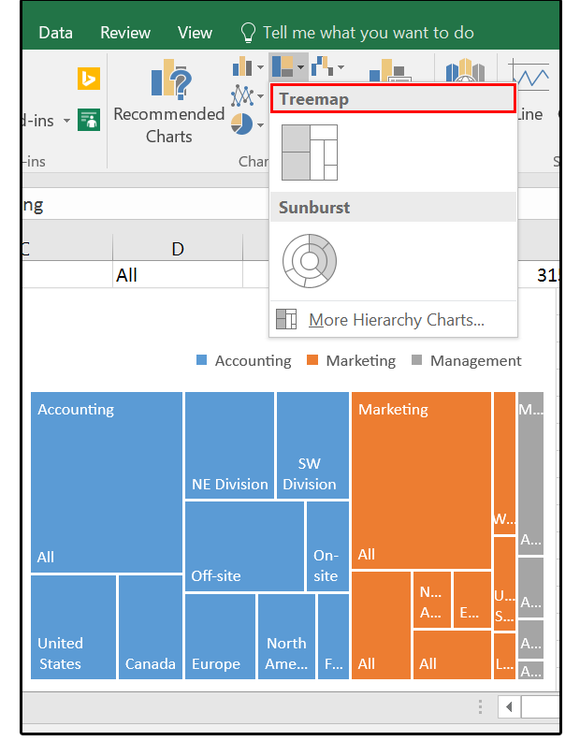
01 Insert the Treemap chart.
The chart drops in and opens the Chart Tools/Design Ribbon menus. Scroll across the Design options and select one that fits your project.
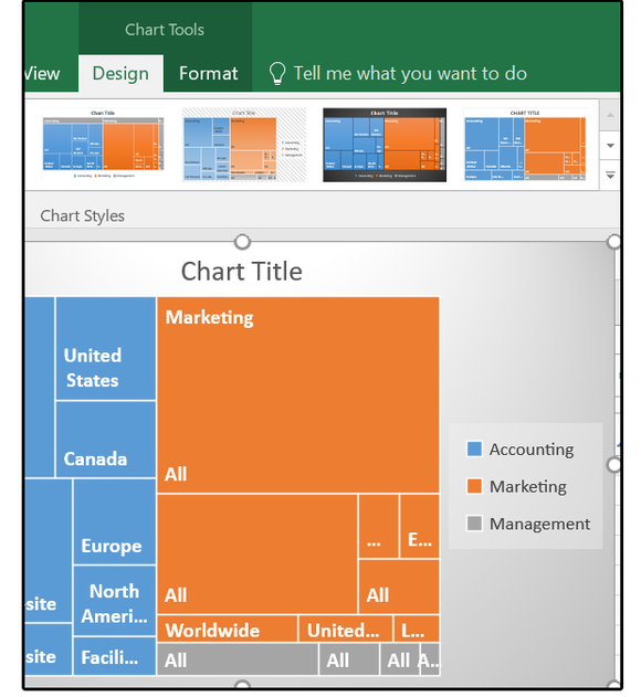
02 Treemap chart Design options
2. Click the + sign to edit the Chart elements: Chart Title, Data Labels, or Legend. Then click the paintbrush to change the chart’s design, such as location of the legend, or font attributes.
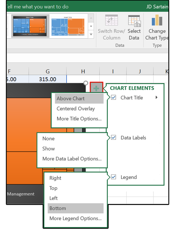
03 Modify chart elements.
3. Right-click any of the rectangles on the chart and select Format Data Series.
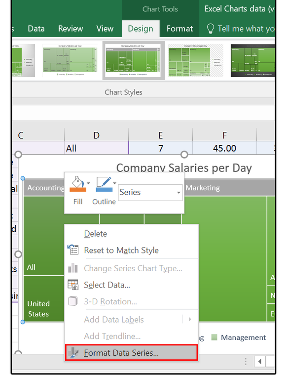
04 Format Data Series on the Treemap chart.
4. In the Format Data Series pane, click Series Options (the chart icon). Click the Series Options down arrow and browse through the menu choices: Chart Area, Chart Title, Data Labels, Legend, Plot Area, and Series. Once you’re satisfied with your changes, close the panel.
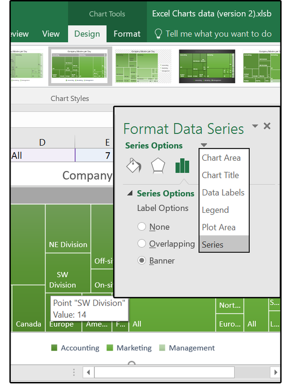
05 Format Data Series options
Sunburst shows hierarchies and relationships
Like Treemap, Sunburst shows visual comparisons of relative sizes, but Sunburst also display the links between the groups and sub-groups. Each level of the hierarchy is represented by one ring or circle with the innermost circle at the top. This visual representation provides deeper, more thorough analysis capabilities, such as identifying the largest contributing elements within a hierarchy of numerous levels.
1. Open your spreadsheet and highlight your data. Click Insert > Insert Hierarchy Chart > Sunburst.
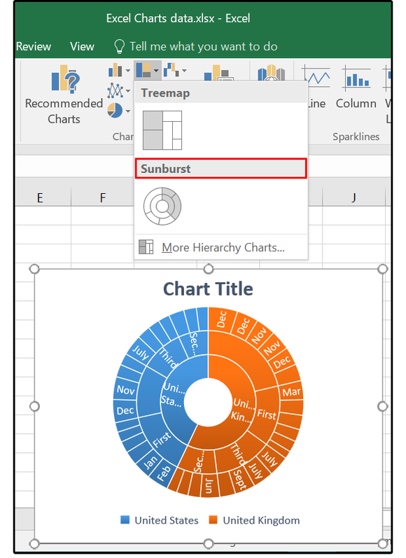
06 Insert the Sunburst chart.
The chart drops in and opens the Chart Tools and Design Ribbon menus. Scroll across the design options and select one that fits your project.
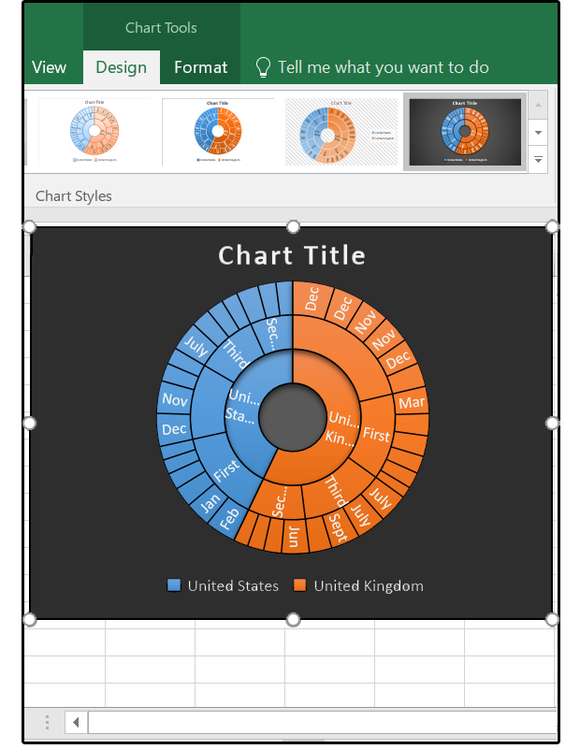
07 Select the Sunburst Design options.
2. Click the + sign to edit the Chart Elements: Title, Data Labels, or Legend. Then click the paintbrush to change the chart’s design.
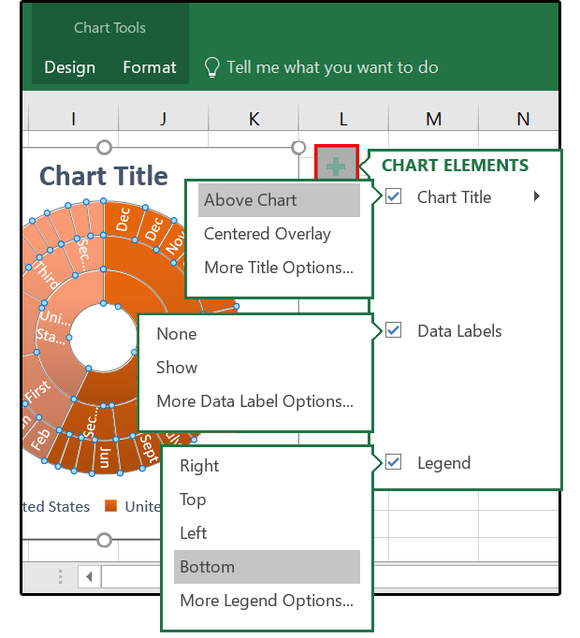
08 Select the Sunburst chart elements.
3. Right-click any of the rectangles on the chart and select Format Data Series.
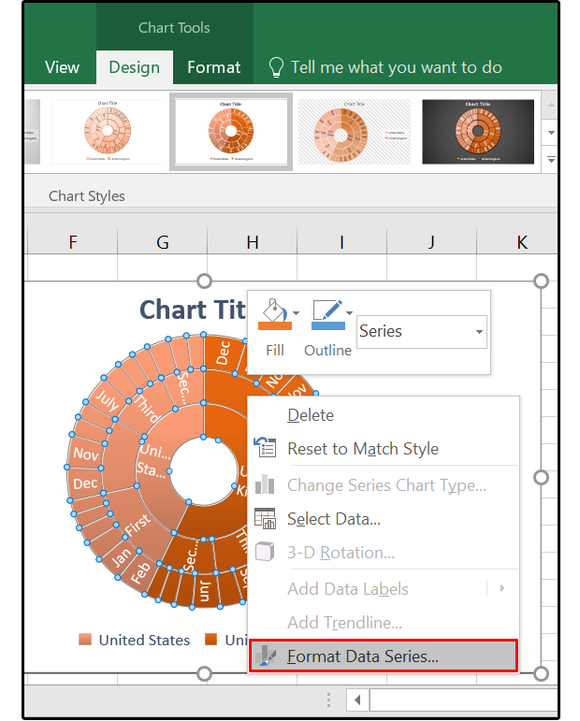
09 Sunburst Format Data Series
4. In the Format Data Series pane, click Series Options (the chart icon). Click the Series Options down-arrow and browse through the menu choices: Chart Area, Chart Title, Data Labels, Legend, Plot Area, and Series. Once you’re satisfied with your changes, click the X to close the panel.

010 Select and modify the Sunburst chart Format Data Series options.
Box & Whisker compares sets of data
The Box & Whisker chart (like the Histogram chart) shows the distribution of information, but this chart delves much deeper into analysis. For example, can quickly and easily emphasize the most unique methods of data distribution such as the mean (average), quartiles, median, and percentile groupings, and it can identify outliers.
Box & Whisker is best for comparing characteristics between different sets of data, as opposed to Histogram and Pareto, which only provide visuals for one dataset.
1. Open your spreadsheet and highlight the target database. Click Insert > Insert Statistical Chart > Box & Whisker. The chart appears and opens the Chart Tools/Design Ribbon menus. Scroll across the Design options and select one that fits your project.
2. Click the + sign to edit the Chart Elements: Axes, Axes Titles, Chart Title, Data Labels, Gridlines, and/or Legend. Then click the paintbrush to change the chart’s design.
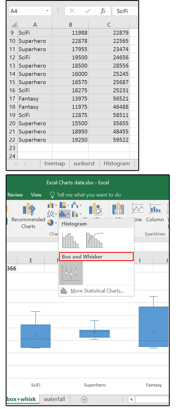
011 Select Database and insert the Box & Whisker Chart.
3. Right-click any of the rectangles on the chart and select Format Data Series.
4. In the Format Data Series pane, click Series Options (the chart icon). Click the Series Options down arrow and browse through the menu choices. Make the necessary changes, then click the X to close the panel.
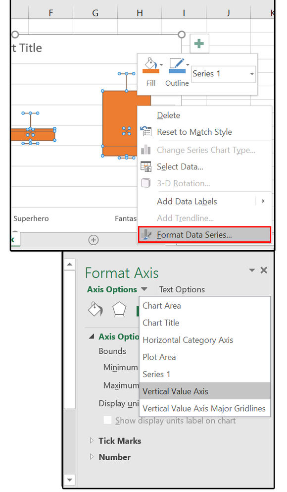
12 Select the Box & Whisker chart’s Format Data Series.
5. Right-click the chart, then click the Select Data button under the Data Type group.
6. The Select Data Source dialog box appears. Under Legend Entries (Series), select Series 1 (or 2, or 3, etc.), click the Edit button, then click OK.
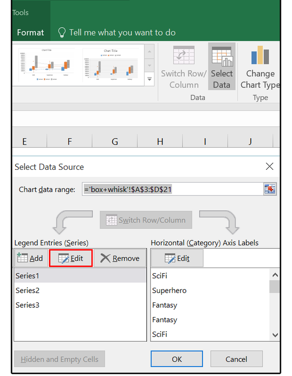
13 Select Data, Select Source
7. In the Edit Series dialog box, under Series Name, type the name of this series group (in this case, U.S. Market, European Market, or Asian Market). Note that the Series Names are the Markets, not the Genres (SciFi, Superhero, Fantasy).
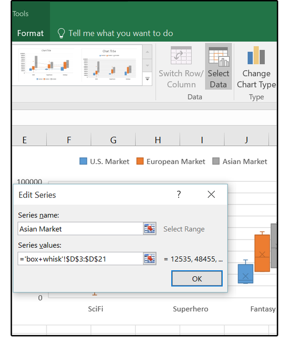
014 Edit Series, Edit Series Name
8. If you need to alter the data range for any of the series, just enter the new range (or values) in the Series Values box.
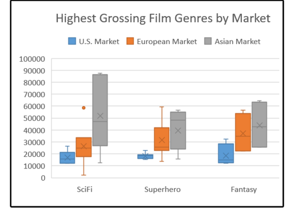
15 Completed Box & Whisker chart.
And that’s all for the new Treemap, Sunburst, and Box & Whisker charts. Next up: Histogram, Pareto, and Waterfall charts.


