5 awesome Android features you probably take for granted

 Image: Ryan Whitwam
It’s easy to become obsessed with the next big update to Android and what we want Google to add, but what about all the great things Android has gained since it debuted nearly a decade ago on the the venerable T-Mobile G1?
You might be surprised by what we used to go without. So it’s time to step back and appreciate what we have. Here are five amazing Android features we take for granted.
Further reading: The best Android phones
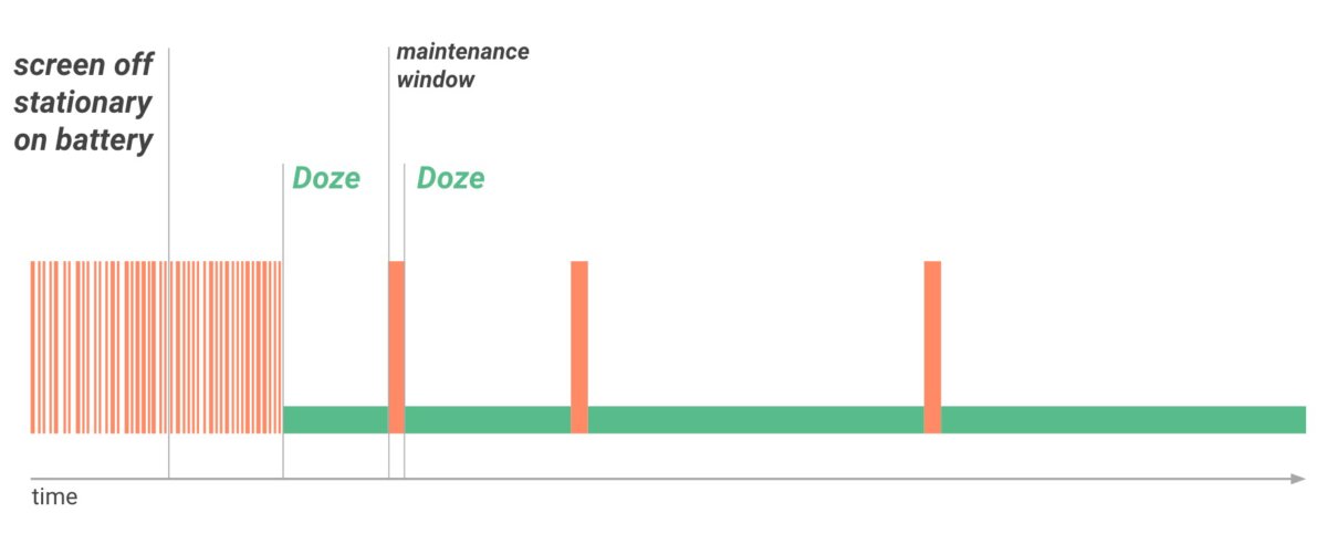
Doze Mode
Just a few years ago, you were bound to wake up to a nasty surprise if you forgot to plug in your Android smartphone before going to bed. Even when sitting idle, apps would continue waking up your phone whenever they wanted, draining your battery in the process. And you were really in trouble if an app encountered an error and caused a wakelock—your phone could be nearly dead (and warm to the touch) in the morning.
 Google
Doze keeps apps from running wild all night.
That all changed when Google introduced Doze Mode in Android 6.0 Marshmallow. After remaining stationary for several minutes, Doze Mode kicks in to keep apps from waking your phone except when very specific conditions have been met. The phone does still wake up periodically for short maintenance windows so apps can “catch up” with the cloud. In Android 7.0 Nougat, Google further improved Doze Mode to work even when your phone is in your pocket.
Standby battery life is on a completely different level now than it was prior to Android 6.0. Those were dark times.
Screen previews in multitasking
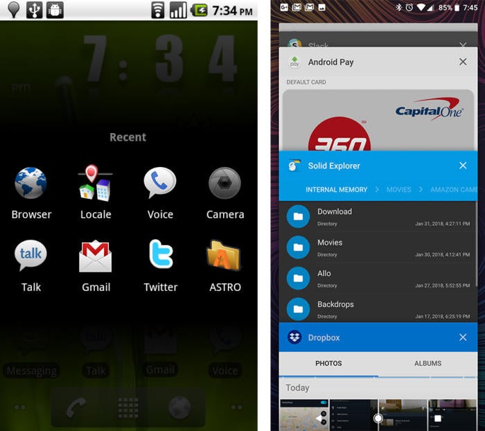
Android has supported multitasking since the beginning, which was one of the main differentiators from iOS at the time. However, switching between apps in Android was very much a clunky experience. In fact, the app switching UI didn’t even have preview screens early on.
 Google
Wow, Android used to be ugly until multitasking previews came along.
Prior to Android 3.0 Honeycomb, Android’s multitasking UI just had a bank of eight icons to represent your recent apps. Honeycomb on tablets and 4.0 Ice Cream Sandwich on phones changed all that. Multitasking now includes a preview screen of the app’s last state before you left it.
Actually seeing screens of the app helps you find what you’re searching for faster, and it just looks nicer.
Chrome Custom Tabs
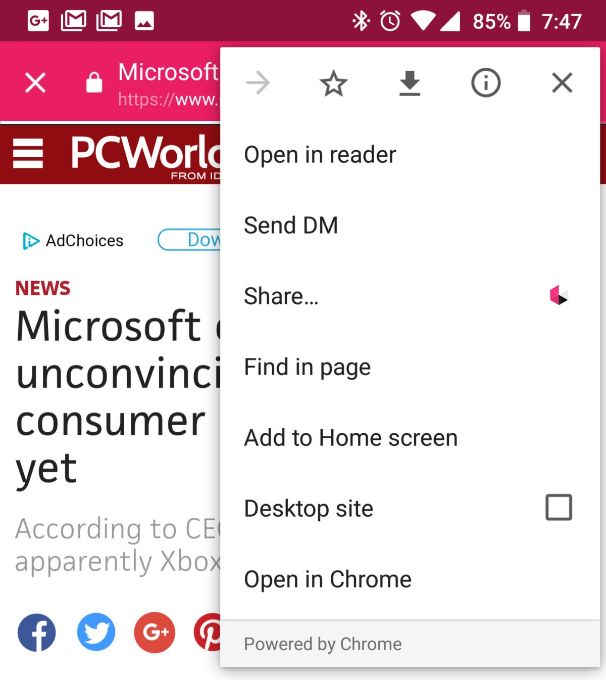
There are numerous reasons why an app might want to display web content, but booting you over to your browser app is a poor experience. Google’s first attempt to solve this problem was called WebView, but the addition of Chrome Custom Tabs to Android in 2015 made viewing web content vastly better.
 Google
Chrome Custom Tabs are faster and more feature-rich than WebView.
Chrome Custom Tabs allow developers to render a webpage inside their app using the Chrome engine. You have access to all Chrome’s basic features like saved passwords, bookmarking, and so on. And if you need the full browser experience, it’s easy to move the active Custom Tab over to Chrome without reloading the content. Chrome Custom Tabs are also much faster than the old WebView option, and they’re updated frequently as part of the Chrome app itself.
Taking screenshots
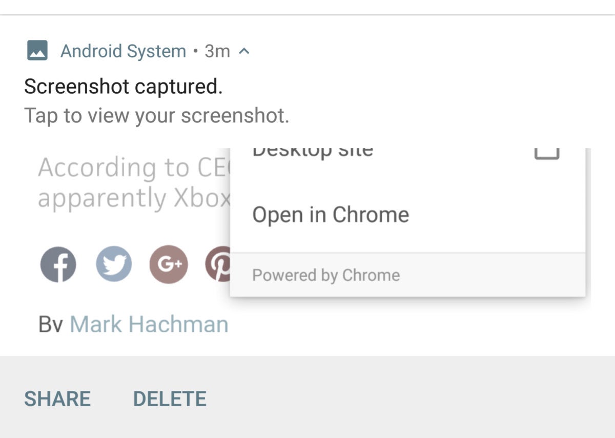
In the early days of Android, you couldn’t take a screenshot on most devices without root access or a PC. The only “official” way to capture a device’s screen was to connect to the Android developer tools on a PC and pull screens over ADB—it was a real nightmare. It’s hard to believe something as simple as taking a screenshot took so long, but Google finally added this feature in Android 4.0 Ice Cream Sandwich.
 Google
This used to require root.
Starting in Ice Cream Sandwich, all devices supported a long-press on power and volume down to capture the screen (home and volume down for Samsung until recently). It was a big deal at the time.
Some OEMs have added their own twist to the screenshot support like instant cropping, scrolling screenshots, and gesture support. Google hasn’t added anything notable to the screenshot feature in stock Android, but that’s fine. At least we’re not still stuck using ADB.
Swipeable notifications
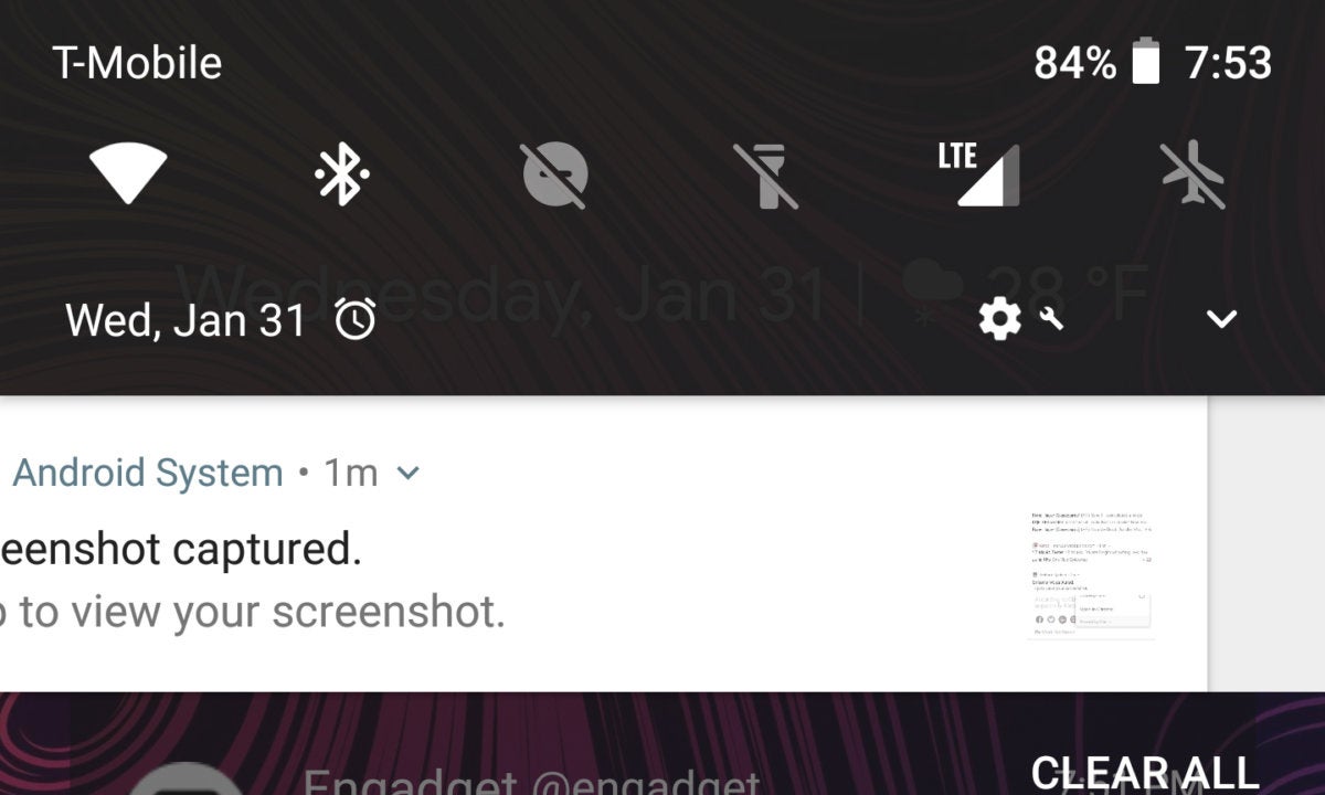
Android’s notification shade was one of its early advantages over iOS—so much so that Apple eventually copied Android. However, there was a time when Android’s notifications were an all-or-nothing affair. You could see your notifications stacked up in the shade, but you couldn’t dismiss them individually. There was only the “Clear all” button.
 Google
Swipe that one notification away instead of clearing everything.
That button still exists today, but Android 4.0 Ice Cream Sandwich enabled a much more granular way of managing notifications. If you don’t want a particular notification in the shade, you just swipe it away. In the Jelly Bean release of Android, Google added the option to swipe down on a notification. Rather than clear the item, this expands it to display more information. These gestures served to make the notification shade a cleaner, more dynamic place to manage your world.


