Meet Opera Neon, Opera's radical vision for the future of web browsers

 Image: IDG / Mark Hachman
Hardware vendors sometimes publicize their visions of the future. So do automakers. Now Opera Software is getting into the game with Neon, the company’s first concept browser.
Opera’s new Neon browser for Macs and Windows PCs isn’t game-changing—in fact, rather than a “concept,” it feels more like applying a fresh coat of paint. But Opera also succeeds in paring down the browsing experience to a few select tasks. It’s a refreshingly attractive design, as Neon’s background blends into your desktop, and circular tabs consciously contradict the sea of rectangles that rival browsers employ.
 IDG / Mark Hachman
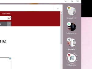
Tabs cluster to the right-hand rail, adjusting their placement depending on their usage.
With that said, Opera Neon won’t replace the existing Opera browser. In fact, Neon is arguably less full-featured than Opera’s existing browser, which includes native capabilities like ad blocking. Opera did say, however, that it plans to migrate some of Neon’s new features to its mainstream browser sometime this spring.
Why this matters: In its current form, Opera Neon is little more than a curiosity. But it’s an important vehicle for showing what the Web could evolve into. Personalization options like Opera’s own themes and Firefox’s comprehensive ”complete themes” only go so far. Microsoft had a chance to demonstrate the future of the Web with Edge, and companies like Brave are working behind the scenes to bring their visions to market. Neon is Opera’s chance to do the same thing.
 Opera
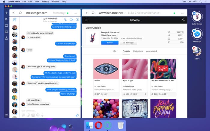
OperaOpera Neon offers its own native split-screen view for viewing more than one tab at the same time.
A fresh, clean look and feel
Opera Neon opens with an arty “homepage,” listing your most frequently accessed pages—or, upon first launching it, the pages Opera thinks you might like to view. Rather than use a custom background, Neon simply uses your existing desktop background to appear less obtrusive.
Instead of squares or rectangles, icons are circular, often highlighting either the Web page’s logo—or in the case of a specific article, the primary piece of art the page is built upon. If you do have a article open, however, the “favicon”—the small icon that a brand is based upon, like the Twitter bluebird—hovers off to one side. There’s also a slightly tweaked “omnibox,” Opera’s search box.
 Opera
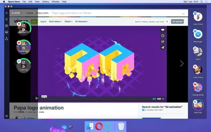
OperaVideos can be broken out from their main page and “stored” under the video tab.
Although the traditional orientation is to keep adding tabs across the top of the browser window, Neon adds them in a vertical column to the right of the browser window. Opera says that the tabs will operate as if affected by gravity, with frequently-used tabs rising to the top, while little-used tabs sink like a stone.
Features that you might find in other browsers, though—like previewing the tab by hovering your mouse cursor over it—simply aren’t present, making Neon more a celebration of form over function.
 IDG / Mark Hachman
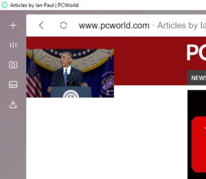
A closer look at Neon’s left-hand nav bar and floating video window.
The left-hand nav bar is reserved for five icons: a “+” to add another tab, a series of vertical lines that hide a video player, a “camera” icon to take screenshots with, a “painting” icon that links to a gallery of those snippets, and a download icon at the bottom. Like Opera’s mainstream browser, the “video player” can be used to separate a video window from the rest of the tab, allowing you to watch a YouTube video, for example, while you shop online. (If a video is playing, the icon ripples, and the favicon on the source tab changes so that you can track down which tab is playing the video.) The “camera” icon also provides a convenient way to highlight and save all or a portion of the screen.
Otherwise, though, that’s about the extent of Neon. Opera’s concept doesn’t really justify the download, though it’s attractive enough. What’s more interesting is if Opera eventually uses Neon as its proverbial garage, hacking together new concepts to see what works and what doesn’t.


